Before & After, Part I

 I always enjoy comparing "Before" and "After" photos of architecture renovations and additions to try and understand what was done and why. So, for this architecture blog to succeed, I can only assume that you are just like me -- curious, intelligent, witty, modest, analytical, urbane, modest, and so so cynical. Harumph!
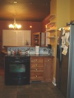
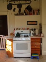
Here are a couple of photos of the kitchen renovation project I mentioned a few days earlier so you can see and appreciate the changes that were made. Please click on the photos to see them enlarged.
As you should note, the biggest change came from removing the wall behind the stove. That wall separated the kitchen from the dining room, although an old brick chimney/flue still remains. We talked about taking that out as well, but decided against it when we realized that there wouldn't be enough benefit for the cost. We also brought the refrigerator into the kitchen for the first time since, well, since the invention of refrigerators. Up until now, the fridge was in an adjacent closet pantry under the stairway. Yeah, really.
In the meantime, I'm not feeling particularly energetic and enthusiastic about my chosen profession. The Hothead got on my case this afternoon after I worked all day on a number of things for him, including drafting and delivering a letter to his HOA President. My client felt I didn't express his beliefs as assertively as he felt them. I, the cool dispassionate professional, disagreed. And besides, the letter had MY name on it.
I hate this crap sometimes. At least in the architecture profession, it's only work about 40% of the time. Gotta remind myself that the other 59% is pure fun! At least the invoice checks are starting to roll in.
For the math majors who are asking about the remaining 1% of my time? Let's not even go there. Thanks.


4 Comments:
OK, so the "After" is on the left ?
Hmmm, good question. If you were the client, the "After" would be whichever one you wanted.
Actually, the format for inserting photos into Blogger posts was a bit haphazard, and I had to insert the photos a couple of times just to get Blogger to post the "Before" photo above the "After" photo. And then I realized that if you turn your Favorite Bookmarks Toolbar off, giving the whole screen over to my blogpost, you end up seeing both photos side-by-side, with the "After" to the left of the "Before".
Can't win.
Open space is gooder than bad. I like the space of the after. I've thought for awhile that the appeal that yippies feel for New York studio apartments, besides the fact that when you call something a studio, chicks think you're artistic and therefore sexy, is that they feel like they're back in a dormroom-like environment, and therefore young and hip. Personally I like walls separating my bedroom from my living room from my bathroom.
I fixed the photos now so they appear correctly, with the "Before" to the left of the "After". Of course, this meant that I had to make the photos microscopic.
Still can't win.
Post a Comment
<< Home