Monday, February 27, 2006

Don't Get Between an Architect and His Movietime

As is the case with all architects -- okay, I know what you're thinking... you're concerned that I started a sentence by grandiosely and unrealistically lumping all architects into the same stereotyped grab bag of universality... but fear not, for this all-inclusivity is entirely accurate, so I continue -- as is the case with ALL architects, I dearly love the movies. I will sit and watch a Don Knotts film (can Don Knotts movies be called "films"?) as enthusiastically as I watch one of the Matrix films as mesmerized as I am when watching anything by Zhang Yimou (Daggers, Heroes, and Tigers, oh my!).

When I watch a movie, I am in that world, and I do not judge. That comes later, when the self-loathing begins. To my credit, my DVD collection contains 115 films, and 80% of them are brag-worthy. Still, I concede that I am far too open-minded and tolerant when it comes to my movietime. Some who are not at all like me in constitution and temperament hate movies that drag on and on and on and on, like 2001: A Space Odyssey and Eyes Wide Shut. Yet I watch them all, entranced and hypnotized. And applaud lustily when the credits roll. Always.

For example, I loved Pride and Prejudice with Keira Knightley and Matthew MacFadyen as Mr. Darcy. Everything about that movie was perfect, from the music -- especially the music -- to the acting, costumes, screenplay, cinematography, and direction. Unfortunately, I was about to link to the trailer for you until I saw that they changed it. The trailer that came out right as the movie was being released was the best trailer I've ever seen. The current one on the website is pitiful and pathetic, retooled for teenaged girlies -- not that there's anything wrong with teenaged girlies, mind you. Just that I am not one myself, so am not impressed with the new trailer. Actually, quite the opposite since I saw the original one.

Funny thing, though, is while I believed for two months that Pride and Prejudice was the best movie of 2005, when I saw Capote two weekends ago with my best girl, I changed my mind. And let me stipulate for the record that I am old enough to remember seeing Truman Capote on teevee and being wholly impressed with his intellect and... uh... eccentricities. Capote, the Oscar-nominated film, is not to be missed, if it can be helped at this late date, and Philip Seymour Hoffman deserves the Best Actor Oscar for his greatest work, which also includes Almost Famous and Magnolia, two other favorites of mine. Catherine Keener as Harper Lee must not be missed either, especially if you're a fan of the book (and movie) To Kill a Mockingbird, as both my best girl and I are.

Now that I have the introductory paragraphs out of the way, let me tell you what I really have in mind.

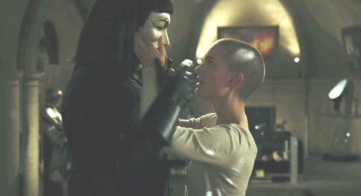
About a month ago, during some big football game, I saw a trailer for The Next Big Film, this one featuring Natalie Portman without hair (as seen above). Now I'm not talking Demi Moore's version of butchiness via baldness as in G.I. Jane. No, Miss Portman, whose character is clearly under duress throughout the film, was more beatific, in the mold of Persis Khambatta from the first Star Trek movie in 1979.

However, the plotline of the trailer looked more like George Orwell's 1984 meets Gattica meets Minority Report meets your worst nightmare. (Come to think of it, John Hurt was also in the film version of 1984, wasn't he, though as the protagonist?) This new film? V For Vendetta, the Wachowski brothers' latest offering. You remember those guys don't you? Matrix, Matrix II, Matrix III, ad infinitum. Yeah, those guys. Hard to believe, but those two have more creative plot lines for us to enjoy than can be played out by the fine yeoman-efforts of actor Keanu Reeves.

March 17th. Here's that trailer by the way: V For Vendetta (requires Quicktime) FYI: The trailer is slow to load.

But more than watching and enjoying the trailer for The Next Big Film, let me steer you to a blog entry about The Next Big Film as written by James Wolcott, one of the finest writers in blogdom. As you read his offering, and read it you must, notice how Wolcott eases into the movie review by peppering his mysteriously unfolding essay with dropped names of the Famous and the Beautiful. And also notice how he never really reviews the movie in the typical I'll-spill-the-whole-plot-out-for-you-because-I-don't-know-any-other-way way. The man's brilliant, but then I'm not saying anything he doesn't already know about himself. I confess that I simply lack the words to describe his transcendent insights, so can only recommend that you begin reading him as regularly as I.

That is all. Until the Next Big Film comes around, of course. Then you can once again expect me to get all giddy as a teenaged girlie -- not that there's anything wrong with that.

Sunday, February 26, 2006

American House Design Awfulness

After my declaration of Death to the Great Room, it got me thinking about other spaces in the Typical North American House, the ways real estate developers have endowed them with fatal flaws, and ways Architects could make them better (assuming we Architects might ever be asked). Most typical design flaws, which I will list for you, are included because of tradition, momentum, marketing reasons, lack of imagination, or the worse reason of all, to appeal to our vanity and sense of prominence and self-importance. Keep these reasons in the back of your mind as you go through...

Howard's List of American House Design Awfulness
(yeah, I could have done better with that title):
  • The Formal Dining Room: Every house over 1,500 square feet that I have been hired to remodel, renovate, and add onto has had one of these utterly useless rooms. By "formal" dining room I mean a private room, visually closed off or separated from all adjacent rooms, and clearly intended to be used as a feed lot for the entertaining and fattening up of honored guests. First off, the vast majority of North Americans (and this includes Canadians) do not use the formal dining room to eat as a family unit, nor do they invite others over to eat any more than three or four times a year, if that. While there is a minority who entertain guests on a semi-monthly basis -- my wife's parents are that notable exception -- what is most striking is that most of us, myself included, think while we're in the process of buying a new house that we'll have friends and family over all the time, and we like the idea of a fancy-pants dining hall to feed the multitudes. But in the end, we don't do it. So our "special" room goes unused for family or guest gustatation, and is used instead to assemble jigzaw puzzles (a nice big table), or it's used to pile things in (again that nice big table), or it's used by the kids for homework due to the relative privacy and quiet (and a nice big table). In all cases where a client includes the renovation of the formal dining room as part of the Scope of Work, I've been asked to remove walls opening it up to the kitchen, or I gave the room even more privacy (along with a lot of added shelving) to create a study, or in one current and notable case, I am converted the dining room into a mudroom with access to the front door and a new door to the garage! Unless you are a dues-paying member of the Minority of Social Butterflies, I say "Death to the Formal Dining Room."
  • The Laundry Room: This room is never really a room in the classic sense because the designation "room" clearly implies that there is actual room to do things in. Laundry rooms are almost always closets or nooks or leftover alcoves as part of a kitchen or mudroom. Or the very worst, they are a converted back porch of a Victorian house that was enclosed in the early 60's so the owners could play Russian roulette with the plumbing since the pipes are vulnerable to freezing and thawing (freezing is bad but the thawing that comes afterwards is worse, much worse). I, and most North Americans who actually do laundry, propose that building codes be passed requiring all Laundry Rooms to be at least as large as the unavoidable Formal Dining Room.
  • The Master Bedroom: I can't believe how huge and spacious these have become in the last 15 years. What do we use bedrooms for? We awaken, we dress, we leave the room, we come back 16 hours later, we undress, the fortunate among us fool around under the covers (either singly or in multiples), then we sleep. How much room does this need to take? Please don't answer this question. Any answer you give will be far too much information for this family blog. Thank you.
  • The Kitchen: This room is clearly the heart of every household, so housing developers and their underqualified "house designers" have made every effort to make this room functional. Thank goodness. [As an aside, I use the term "house designers" because that's truly what they are -- architecture school drop-outs or wanna be's who don't have the expertise or credentials to become licensed architects. And these "house designers" have been the ones responsible for designing over 95% of all housing in North America since World War II. Why? Because they're cheap. No wonder most of American housing looks like hell, huh?] Anyway, back to kitchens. I, as an architect, have been hired to upgrade finishes, open kitchens up to dining rooms (see above), and convert 1950's kitchens into 21st-century kitchens with great lighting, updated appliances and fixtures, new plumbing lines for refrigerator ice makers, and actual useful peninsulas and islands (as opposed to the useless ones). Kitchen design almost always gets stylistically dated very quickly -- often within 10 years -- but rather than get all critical of kitchen design in contemporary tract housing, I will ask my readers for their input here. What typical kitchen features don't work as intended? Or better yet, what features work despite their intended design?
  • The Most Useless Space: Far and away, the most useless room in most houses is the "formal" living room (as opposed to the family room where actual living takes place). What makes the living room particularly useless is that, first of all, it's often an uncomfortably formal show-off room, and second, half the typical living room is devoted to circulation from one adjacent space to another adjacent space. Furnishing such a room, even while acknowledging traffic patterns rather than fighting them, which just makes it worse, is one of the greatest challenges for home owners. The great room that I wrote about a week ago is a classic example. It's located between the foyer, the entry to the master bedroom suite, the kitchen, the stairs, and the useless formal dining room. Thus, the great room is rarely used since most of the space is devoted to pedestrian use, leaving only two small corners for actually sitting/reading/conversing. Entertain guests in such a room? Forget it, even overlooking the unrealistic assumption that any of us might actually invite neighbors and friends into our houses. The two small corners of my clients' great room do not have good windows, views, light, or privacy of any sort. On top of that, their great room is always cold -- so cold that the owners placed an electric space heater in the middle of the room, in the middle of the pedestrian right-of-way, to keep it and the 20' ceilings warm.
  • Spaces We Would Love to See: 1) More indoor-outdoor connections. An eating nook with lots of glass looking out on a covered patio and a view beyond, even if it's just a view of a lawn or a victory garden, is a wonderful way of enlarging the spatial feel of a house without actually paying to enclose all that expensive space. Of course, if you want a large window with view and you live in a cold climate, you'll need highly-insulated low-E glass. 2) Indoor dog rooms. My household's dogs are large and stinky, so we never let them into the house. They live in the garage instead. If I didn't kick them out to the backyard between the hours of 9 am and 5 pm every day, they would never leave the garage except to pee and poo. If there was a small room dedicated to the dogs with a utility sink and concrete floors like a garage that could be swept (and hosed as necessary), and perhaps if this room had a Dutch door so the upper half of the door could be opened so the dogs might actually hear us and breath the same air as us (assuming the dogs aren't too stinky for the people, or vise versa), this could be a great addition to the American home. Actually, I have designed just such a room for two current clients, that's how smart I am! 3) And Finally: Include better and bigger mudrooms -- actual mudrooms -- with places to sort and store the mail, the keys, the cell phones and Blackberries, the spare change, and the coats, scarves, gloves, and galloshes.
So that's it -- my list of grievances with the functional aspects of house design in North America. I'm not even going to touch on the aesthetic side or the mechanical systems side (heating, air conditioning, plumbing) or the regional responsiveness side (regionally appropriate design and orientation to solar, wind, and view). Nah. Those grievances will have to wait for another day.

Yeah, North American housing design, as designed by North American house designers, sucks. Some houses and neighborhoods are better than others, of course. But they all still pretty much... well... suck. And that's sad to consider: All the billions, no, make that trillions that have been spent for such mediocre results...

Friday, February 24, 2006

Busy Busy Busyness

Yeah, I know. It's been a while since I posted anything interesting around here. If you can get past the shock of hearing that I’ve reproduced, I’ll tell you what my son tells me: that bloggers who don't post regularly lose readers. I'm sure he's right, especially considering that 1) he's always right, and 2) I have built up about 12 regular readers as of this week, and losing even three of them would represent a 25% loss in blogger momentum that we’ve built up with this mighty architecture juggernaut of ours. And as we all know, a juggernaut without momentum is nothing more than naut.

I'm pretty sure my last post -- Pretty Little Things, Part VII, or whatever I called it -- doesn't really count either. I admit it was a 'filler' post, though I really do admire the designs and The Architect behind them. For example, did anyone notice how the roof on the one house matched the slopes of the mountains in the background? I’ll wait while you go check this claim. Go ahead, I’ll still be here… Did you see it? Wow is right.

But back to my lack of postage...

My slacker excuse? Busyness.

First, construction has started again on the million-dollar house. I'm dealing with a lot of stuff like stained concrete floors in the basement and backfilling and double-checking plumbing schedules prior to the plumber ordering all the fixtures. Second, I'm also thinking about the house with the soon-to-be-subdivided-Great-Room and preparing a design services contract prior to a meeting with the couple this weekend. And third, I'm trying to design the exterior elevations of the hippie house addition in the foothills (you know -- the one with the most awful floor plan that should be wondrously all better in a few months. I'll try to post floor plans one of these days so you can agree with me.)

So please be patient. I have news updates and photo updates a brewin'. And I haven't even told you yet about my lunch reunion two days ago with the old architecture gang in the neighborhood megalopolis. I have to write about them as they represent one sixth of my readership!

If you read carefully between the lines here, you might infer that this blog (and by additional inference, this blog’s readers) are waaaaay down on this architect’s list of priorities. Perhaps so. But until we can figure out a way to develop a revenue stream for Howard and His Laughing Ways, you’re going to have to be patient while I deal with the paying customers first.

But Hey! This pile of excuses turned out to be a real post after all! That'll be $75 please.

Tuesday, February 21, 2006

Lovely Images, Part II


Each of these photos is of a real place in the United States. Each represents a feat of tremendous courage and trust on the parts of all involved. As such, each represents one of the most remarkable contemporary architectural achievements to be found in their respective western states (Arizona, New Mexico, Colorado, Wyoming). And all of them were designed by the same Famous Architect I earlier wrote about meeting nearly 20 years ago. You may click on any of the photos to see a (much too slightly) larger version. Enjoy.

Sunday, February 19, 2006

Death to the Great Room

I'm pretty sure I bit off more than I can chew today. You see, I met a new client duo this afternoon, and after listening to them tell me their idea to convert their first floor master bedroom suite to a nice private study, while expanding their currently unused Great Room into the adjacent master bathroom area, they concluded the architectural domino parade with the new necessity of adding on another master bedroom suite to make up for the previous one.

I couldn't take it anymore, as I am a great fan of finding new and more productive use of miserable floor plans versus the bigger-is-better idea of adding on more and more cancerous lesions to a lost architectural cause.

So what did I recommend? I asked them to consider ditching their Great Room -- which as an architectural residential concept that has swept the nation in the past twenty years, ranks as the greatest failure of imagination leading to unintended consequences since the sports utility vehicle. You know what I'm talking about -- you walk into a shiny new house and transition from an overly-scaled echo chamber called a foyer into a two-story behemoth of spacial and acoustical heebie-jeebies. You can't help but be impressed when you see that your Neighbor Jones has her own piece of the Taj Mahal. And you begin to yearn for that grandeur yourself. You can't help it. It's just so damned huge and majestic and rich-looking and... impressive, yes, impressive!

But Warning: The Great Room is the architectural equivalent to the Hummer! Because when you finally buy that piece of the Taj Mahal and you try to live in it... well, that's where the horror begins to sink in, and you find yourself slinking away to the nooks and crannies of your basement for the true solitude and quiet that you seek. The second guessing takes over as you ask why houses can't be filled with nooks and crannies instead. This usually happens each month as you write out that massive mortgage check and the equally massive check for the heating bill to warm your architectural Hummer.

The Great Room is an unusable scam that market-wise developers foisted upon unaware American Consumers, and those unfortunate consumers only realized they were had after moving in and trying to live in the voluminous madness.

So when I was faced with this Great Room at the heart of their house, while the client was asking me to convert perfectly good first floor space into private study space that can actually be used by real people -- a request that necessitates the addition of ANOTHER 400 square feet of master bedroom and master bath to be added like a tumor to the side of their house -- I couldn't stand it. I told them to dump the Great Room instead, to extend the second floor through the upper half of the unused Great Room, dropping the ceiling of their new living room down to nine feet instead of 18, and then convert their unused "formal" dining room into the study they seek, and while they were at it, realigning the stairs to provide better access to the new space upstairs while moving the stairs out of the traffic flow from the front door to the kitchen.

They loved it! They called me their muse, and wondered aloud why they hadn't considered such brilliance themselves.

And it all made perfect sense to me at the time. But now I have to figure out how to structurally support the new floor and ceiling over the Great Room that converts to a useable living room. There will be beams and joists and columns dropping down through the basement below, and footings, and... oh lord, what have I done? I've killed the Great Room but created an engineering nightmare for myself. At least it should cost them less money than building a new tumor of a master bedroom suite.

And what was it I wrote a few posts back about the most challenging design problems resulting in the most creative and wondrous design solutions? Creativity, don't fail me now. I need a muse of my own!

Thursday, February 16, 2006

Howard's Blog of Fame: The Mansard Roof


I have a pretty picture to show you. It is quite possibly the most amazingly perfect example of a mansard roof that I have ever seen. I came across it a few years ago, and copied it into my laptop archives. It is such a striking drawing of a mansard roof, that I think it deserves its own stand-alone entry as the maiden installment of what I am calling "Howard's Blog of Fame".

But first a little history lesson so you will have a bit of deep-felt appreciation that a little historical understanding might bring...

T
he mansard roof had an unusual origin dating from the time of early 17th-century French royalty. During this era, Parisian property was taxed on the basis of the number of floors below the roofline. These taxes went to support the grandeur of the royal court and, as you might imagine, the high taxes were wildly unpopular. A French Baroque architect, Francois Mansart, began to design buildings with an apparently lowered roof height -- in essence an 'attic' that could still be used and even rented out as occupyable space -- in order to increase building area while keeping the property tax of his clients to a minimum.

A mansard roof style has two vertical slopes on each side of the building; the lower slope might be straight, concave, or convex (in this case: convex), and is much steeper than the upper slope, which can be low-sloped or often appear to be flat on top.

Mansard roofs were and still are one of the most noticeable features of French revivalist architecture, as it was brought back to vogue two hundred years later in the mid-19th century during the reign of Napoleon III, becoming a key design element of the Second Empire style. The Louvre Museum is a good example of a building built at this time (actually the Romanesque building was remodelled and added on to) using this particular architectural revival style which included extensive use of the mansard roof. Google it if curious. I'm not going to do it all for you.

One more detail of the mansard story that I recall from architecture school was that Napoleon III commissioned Baron Haussmann, a French planner, to develop a master plan for the redevelopment of Paris. This resulted in all the wide boulevards that radiate throughout the city, as well as the construction of new water supplies, sewers, parks and gardens, and many prominent public buildings such as the Paris Opera House and the Arc de Triumphe. This city planning concept was an immediate success and was highly influential in the planning and layout of Washington D.C.

But what does this have to do with mansard roofs? One of the limitations placed on new construction along these new Parisean boulevards by Haussmann was that buildings could only be five stories high, with the top story being a mansard roof in the Second Empire style. With over 60% of 19th-century Paris being affected by this planning scheme, you can see the mansard everywhere in photos of Paris today.

Okay, now that you have been edumacated about the mansard roof, you may closely study the above drawing of what is quite possibly the most gracefully designed and proportioned mansard ever conceived.

You're welcome.

Update:
The roofing material used on mansard roofs is traditionally slate tile, black and heavy -- though sometimes terne metal will be used in regions like the American Gulf Coast. Terne is nickel gray and metallic.


Tuesday, February 14, 2006

An Architectural Valentine


Yeah, I'm an old softie. And there's nothing as romantic as the annual wheeling out on Valentine's Day of the photograph of The Famous Architect's New Mexico Heart Clinic. For you see, waaaaaay back before The Famous Architect was waaaaaay famous -- he in fact received the 2006 American Institute of Architects Gold Medal four short days ago -- one of his earliest projects was to design a heart clinic alongside Interstate 25 in south central Albuquerque in the American state of New Mexico. Didn't know that New Mexico was an American state? You thought it was part of Mexico... one of the newer parts? Well now you know.

So how did The Famous Architect, who wasn't quite so famous at the time, use his hearty courage when designing one of his earliest projects? He designed a mountainous wall of CMU (short for "concrete masonry units", also known as concrete blocks) that faced towards and buffered noise from the ribbon of four-lane concrete speedway not fifty yards away. Only a handful of windows pierced the mountain of CMU... and a glass block heart-shaped feature near the CMU mountain's peak graphically telegraphed the function and purpose of the CMU mountain to speeders wizzing by. On the far side of the CMU mountain there resided a simply stacked group of New Mexico Heart Clinic offices and exam rooms and reception areas and water fountains and all the necessary spaces required by doctors busily treating their patients.

Bear in mind, this all happened well over 20 years ago when architectural guts were few and far between. And while the New Mexico Heart Clinic is still there, The Famous Architect has moved on to even bigger and better things.

Still, I can say I shook The Famous Architect's hand, as did my friend, who was a fellow future architect-to-be. And what did we say to The Famous Architect when we met him in his Early Years, as his fame at that time was a miniscule dollop of the Future Fame to come? My fellow future architect friend marshalled his own set of undergraduate guts and said, "I think you're great!" to which The Famous Architect grinned and replied with equal enthusiasm, "I think you're great too!"


My brush with greatness. And to all [architecture] lovers out there: Happy Valentine's Day... with a heart-felt twist!

Monday, February 13, 2006

Howard's Grab Bag of Fun, Part II

I have a couple of items I would like to mention, and though none of them merit their own special posting, I'll put them into the ol' Grab Bag of Fun:
  • Construction on the million dollar house -- I did tell you that the final total cost for the Hothead's house will be about a million clams, didn't I? -- anyway construction will resume tomorrow after the Homeowners Association Architectural Review Board gave us their blessed approval Friday night. They added a few zingers that will add a few thousands to the cost, though they could have waived certain requirements like they had for other homeowners in the neighborhood. But after all the insults and pressure that Hothead exerted these past ten days, it's amazing that he's not being forced to rip out his foundation and start the design again from square one. Thank God for that, at least.
  • I still haven't heard from the nice couple looking to build a new million-dollar house of their own that I interviewed with a few weeks ago. At the time I met them, and wowed them with my niceness, they hadn't yet closed on the land. That's what I was told to wait for. Now that enough time has passed that they should have bought it by now, it doesn't look too good that I haven't heard a thing. Damn it all to Hades.
  • How have most of the projects I've signed to actual contracts in the past three years come to me? Internet advertising on particular specialty websites, believe it or not. I have a moderately nice and helpful website for my own firm, plus I advertise in two specialty locations that have caught the eye of most of my clients looking for a specific approach. Yellow page ads and other more traditional routes have brought me phone calls (leading to a few interviews and lots of solicitations and resumes), but not one single project yet. I'm hoping that a few referrals from happy clients will soon get the ol' waterwheel of progress turning. Which is why I've been so patient with the Hotheaded Client.
  • Here are some links to books I've loved. You can't go wrong with any of these: Prodigal Summer by Barbara Kingsolver, The Fool's Progress by Edward Abbey, Desert Solitaire by Edward Abbey, everything by Richard Rhodes, The Geography of Nowhere by James Howard Kunstler, Home From Nowhere by James Howard Kunstler, Cat's Cradle by Kurt Vonnegut, To Kill A Mockingbird by Harper Lee, Zen and the Art of Motorcycle Maintenance by Robert Persig. That's enough for now. When you're done with those, I'll be back with more...

Sunday, February 12, 2006

Lovely Images, Part I


Just to prove to you that I am the Bad Boy of Architecture Bloggists, I am starting a new series that I'm calling Lovely Images. And what part of this qualifies as Bad Boy behavior? Why, I'm not going to give proper attribution to the deserving architects who designed these wondrous spaces and plans. You simply choose to enjoy them or not. And please note that if you want to see larger versions of the photos or plans, just click on them and a wildly enlarged version will magically appear. OK, maybe it's not magic ... unless you're a Kalahari Bushman or something.

Enjoy...

Saturday, February 11, 2006

Does Architect Eero Saarinen Know?

The Gateway (St. Louis) Arch in happier days
by Alexis Rockman from Orion Online

Thursday, February 09, 2006

Howard's Grab Bag of Fun, Part I

Since I've captured me some of that blogospheric market share after only 10 posts to The Big Archi-blog of Fun, I'm beginning to receive requests to do riffs on various aspects of The Profession. And that's nice, thank you. But I just don't have the energy tonight to write about something meaty and substantial like Why Does American Architecture Look So Crappy? And where is the country headed architecturally when James Howard Kunstler's Dire Predictions Come to Pass? And are architects and their design firms as surreal as This Guy? (click on the video titled "Architect") Okay, that last topic isn't very meaty and the answer is, "usually not, but sometimes yes." But we architects sincerely do like to wear the black spandex. That part is true. And we pout a lot. And we are all pretentious as hell, every last one, because we consider ourselves the Gatekeepers of Culture. Michael Graves designs kitchenware for Target? Game, set, and match.

Instead, I would like to start an (ir)regular series called "Howard's Grab Bag of Architecture." None of these micro-topics is worthy of a free-standing post, but all are of interest to your Blog Host:
  • I received a resume yesterday from a graduate of a two-year community college, having earned an Associates degree in Drafting. And this guy--we'll call him Stan--tells me he's been working in an architect's office in a Midwestern state since April as an "Associate Architect". Stan goes on to say that he's looking for a job as an Architect or Associate Architect in my fine city and would I be interested in continuing this fine conversation? Well, huh. Does anyone spot the problem here? Or to give a broad hint: What would you think if someone with a two-year Associates degree in physical education from Redstate America Junior College was to apply to a hospital for a job as an Associate Surgeon? I feel sorry for Stan because I doubt that his job search is going to pan out. I won't be hiring him. Heck, I may even poke fun at him. We'll see...
  • It has long been an architectural axiom that projects with the most challenging and restrictive programs (i.e. the initial conditions of a job site, budget, and the client's requirements and expectations to be met) typically result in the most remarkable and delightful design solutions. This is unequivocably true. Let me tell you that I personally witnessed this once again today on a renovation/addition project for a wonderful couple who live in an eccentric house with the worst floor plan and layout of 2,300 square feet that I have ever seen. I'm. Not. Kidding. The first floor is particularly acid-reflux-inducing. But in four short hours today, I solved all their problems. And it should be within budget too. I've been procrastinating for weeks now, putting them off and making excuses, because I just couldn't see how anything good could come out of something so awful. And yet I did it this afternoon in a flood of inspiration. All I can do afterwards is shake my head in wonder. But then I remind myself that we're still in Schematic Design phase. There's still time to screw it up.
  • Why do so many successful and famous architects find it so hard to stay faithful to their spouses? (Just thought I'd throw that out there. Attention family members: I'm not implying anything. Besides, I'm hardly successful. Or famous. Yet.)
  • The best and clearest indicator of whether your architect or contractor considers you a good client or a bad client: If a troubling issue comes up, do you delay paying your invoice for last month's efforts because you want to see how it all works out first, regardless of whether anyone's at fault? That one's the giveaway.
  • Architects don't ever retire. I haven't met one yet who just hung up his Mayline and Mylar and walked away. It's just too damned much fun! Who could give it up?

Tuesday, February 07, 2006

Before & After, Part I


I always enjoy comparing "Before" and "After" photos of architecture renovations and additions to try and understand what was done and why. So, for this architecture blog to succeed, I can only assume that you are just like me -- curious, intelligent, witty, modest, analytical, urbane, modest, and so so cynical. Harumph!

Here are a couple of photos of the kitchen renovation project I mentioned a few days earlier so you can see and appreciate the changes that were made. Please click on the photos to see them enlarged.

As you should note, the biggest change came from removing the wall behind the stove. That wall separated the kitchen from the dining room, although an old brick chimney/flue still remains. We talked about taking that out as well, but decided against it when we realized that there wouldn't be enough benefit for the cost. We also brought the refrigerator into the kitchen for the first time since, well, since the invention of refrigerators. Up until now, the fridge was in an adjacent closet pantry under the stairway. Yeah, really.

In the meantime, I'm not feeling particularly energetic and enthusiastic about my chosen profession. The Hothead got on my case this afternoon after I worked all day on a number of things for him, including drafting and delivering a letter to his HOA President. My client felt I didn't express his beliefs as assertively as he felt them. I, the cool dispassionate professional, disagreed. And besides, the letter had MY name on it.

I hate this crap sometimes. At least in the architecture profession, it's only work about 40% of the time. Gotta remind myself that the other 59% is pure fun! At least the invoice checks are starting to roll in.

For the math majors who are asking about the remaining 1% of my time? Let's not even go there. Thanks.

Thursday, February 02, 2006

Self-Satisfied Pride


The adventure of the Hotheaded Client continues without delay. Or maybe I should say it continues, yet with absolute delay. For you see, the HOA President did not react well to the insults directed his way on Tuesday [see previous blogpost], so he sicced the attorneys on us all, manifested in the form of a Cease and Desist Letter sent to my client, but also copied to the Architect (the hero of this bloggy tale of woe) and the Contractor (a very competent and sweet man who has my total respect). We, the Hotheaded Client and I, have scrambled to answer the concerns of the Cease and Desist Letter, but the HOA board cannot meet again for about ten days. So the Hotheaded Client gets to cool his heels while I hopefully get to focus my energies on other projects and other clients who are most wonderful and deserving of my time.

For example, above is a [night-time] photo of a wonderful project that was just finished a few weeks ago. The photo is of a significant kitchen/pantry/dining room remodel that cost only $10,000 to complete. Kitchen remodels usually start at $25,000 and go up up UP. You wouldn't even recognize this new kitchen if you had seen the before photos, it was that bad. The house was a modest Victorian that had gone to seed in a wonderful neighborhood. Nothing but promise. The client wisely hired me two years ago, spent $75,000 (not counting design fees) to remodel, piece by piece, just about every room in the house and add on over 300 sq. ft. to the back for a new family room -- also in the Contemporary Arts & Crafts style you see above (the addition is barely visible beyond the kitchen). The house appraised yesterday for about $175,000 more than it did when we started. How did we remodel the kitchen, open it up to the dining room, and install new granite countertops, three new cabinets, high-end light fixtures, new appliances, new sink and faucet, porcelain tile floor, and ceramic tile backsplashes with accents... all for only $10,000? Genius, sheer genius. And the builder who did the kitchen work for the client even came away with spending money in his pocket and a smile of self-satisfied pride on his face. I will be using him again and again, that's a certainty. I already have him locked up for a second $100,000 facelift project in the nearby foothills.

Yes, it can be done.

That's the message for today, young pups -- it can be done.